Branding
The design for “Tio Cencio” blends sophistication with warmth that reflects the culinary journey it offers. By utilizing an elegant and bold font the stage is set for a delightful experience. The two high contrasting spot colors: Tierra and Luz, create a comfortable ambiance. The captivating logo sets the personality of the brand depicting the generations of family recipes. This project conveys a romantic atmosphere where adults can be immersed into a heaven of enticing flavors of Mexican cuisine with a modern twist.
Business Card
Folder & Letterhead
Menu
Take Out Bags
Stationary & Web Design
Mobile Web Design
Social Media Design
Social Media Templates Design
Social Media Templates Design
Social Media Design
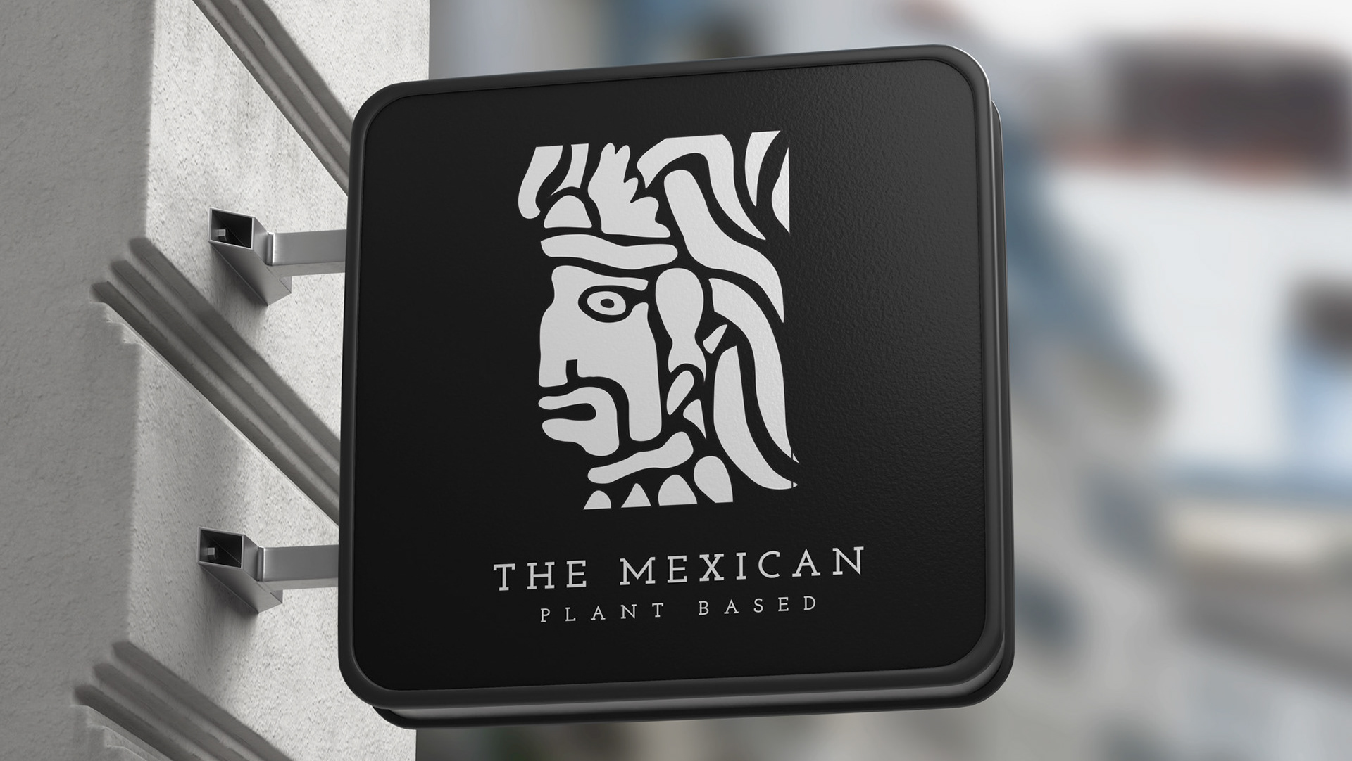
Restaurant Sign
